Introduction
Walk into any store and you’ll see shelves packed with products that feel like they’re all shouting for your attention. Bold fonts, bright colors, unusual shapes—every little design choice is made to grab hold of your eyes before you can blink. But only a few packages actually make you stop and pick something up. That’s not an accident. The design of your packaging is often the very first interaction someone has with your brand, even before the product inside gets a chance to speak.
Shelf appeal is more than good looks. It’s strategy. Strong package design pulls people in, tells a story in seconds, and earns a spot in their cart. Whether you’re designing for a retail shelf, trade show booth, or pop-up table, your packaging needs to speak clearly and confidently. The right design choices—color, structure, typeface—can do a lot of heavy lifting to help make that happen.
Color Psychology: Using Colors That Catch the Eye
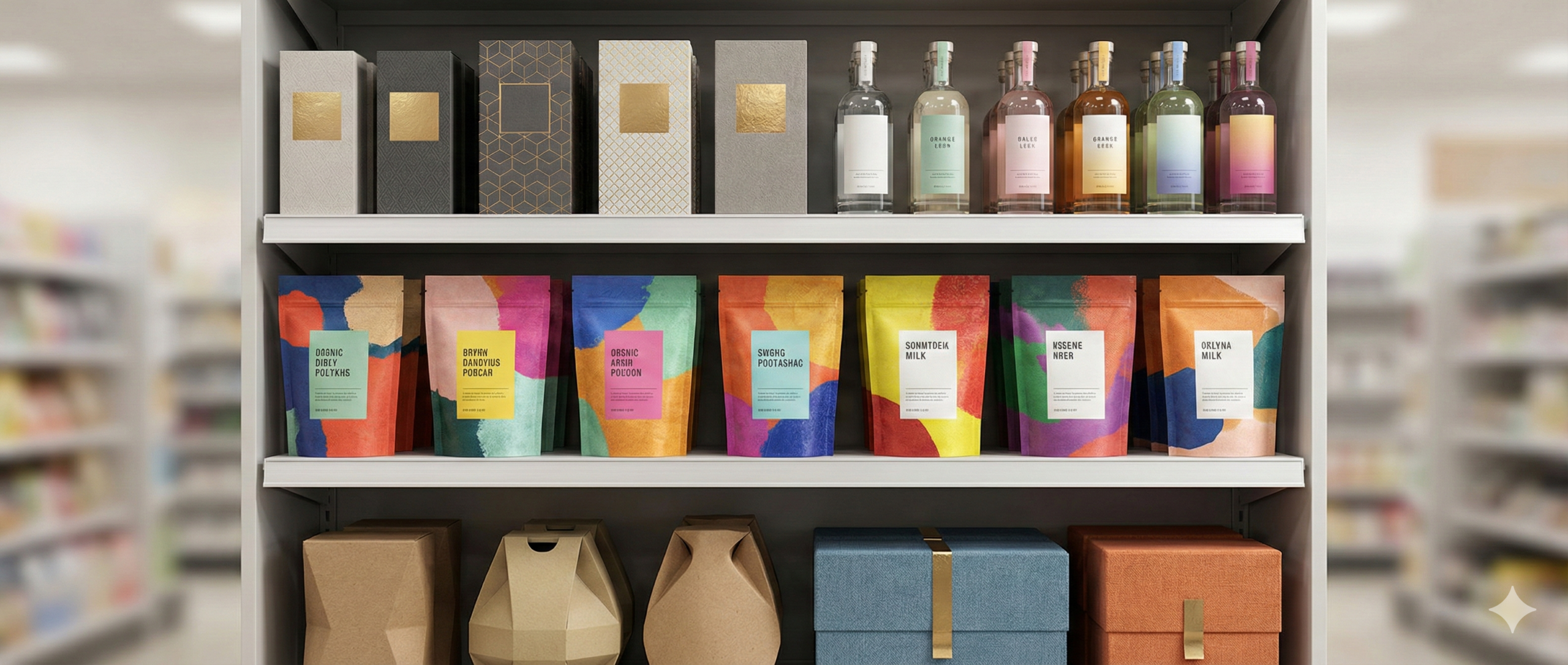
Color plays a big role in how people react to packaging. While there’s no universal best color for every product, certain palettes tend to spark particular feelings. Reds and oranges feel energetic and bold. Greens tend to suggest nature or freshness. Blues bring a sense of calm or trust. Picking the right shade can help create an instant emotional connection—whether it’s interest, reassurance, or even hunger.
When thinking through color choices, consider:
– What kind of feeling the color should trigger
– How the color fits into your product category
– Whether it helps the package stand out in a typical retail setting
– How it connects with your existing brand identity
Say your product is a new line of natural cleaning sprays. You could go with beige and light green for that eco angle, or maybe a fresher coral and navy combo to feel new and energetic. The trick is staying true to your product’s vibe while making sure it won’t disappear next to competitors on a crowded shelf.
Color can also help build brand recognition. Once people connect with your product, repeating that same palette across future releases keeps things familiar and builds trust. It’s about being consistent, while leaving room for evolution as your product line or audience shifts.
Typography: Fonts That Speak Volumes
Fonts carry more than text. They help carry meaning. The typefaces you choose say something about who you are as a brand before your customer reads a single word. A bold serif font can feel nostalgic or high-end. A clean sans-serif can feel modern or friendly. Get the choice wrong, and your packaging might feel messy, cheap, or hard to read.
Here’s how to keep typography on point:
– Stick to fonts that are legible, even from a few feet away
– Limit your design to one or two fonts to reduce visual noise
– Choose a typeface that matches your tone and audience
– Always test a printed version—not just a digital mockup
If you’re working on a specialty coffee product, maybe a hand-drawn look showcases the artisanal side, while a strong, blocky font tells people what they’re getting at a glance. The layout also matters. Good spacing between letters and lines makes everything easier to absorb, especially when shoppers are walking by quickly.
Great typography doesn’t need to be the star of the show, but it should never hold your brand back. Aim for balance—readable, clean, and in sync with your vibe.
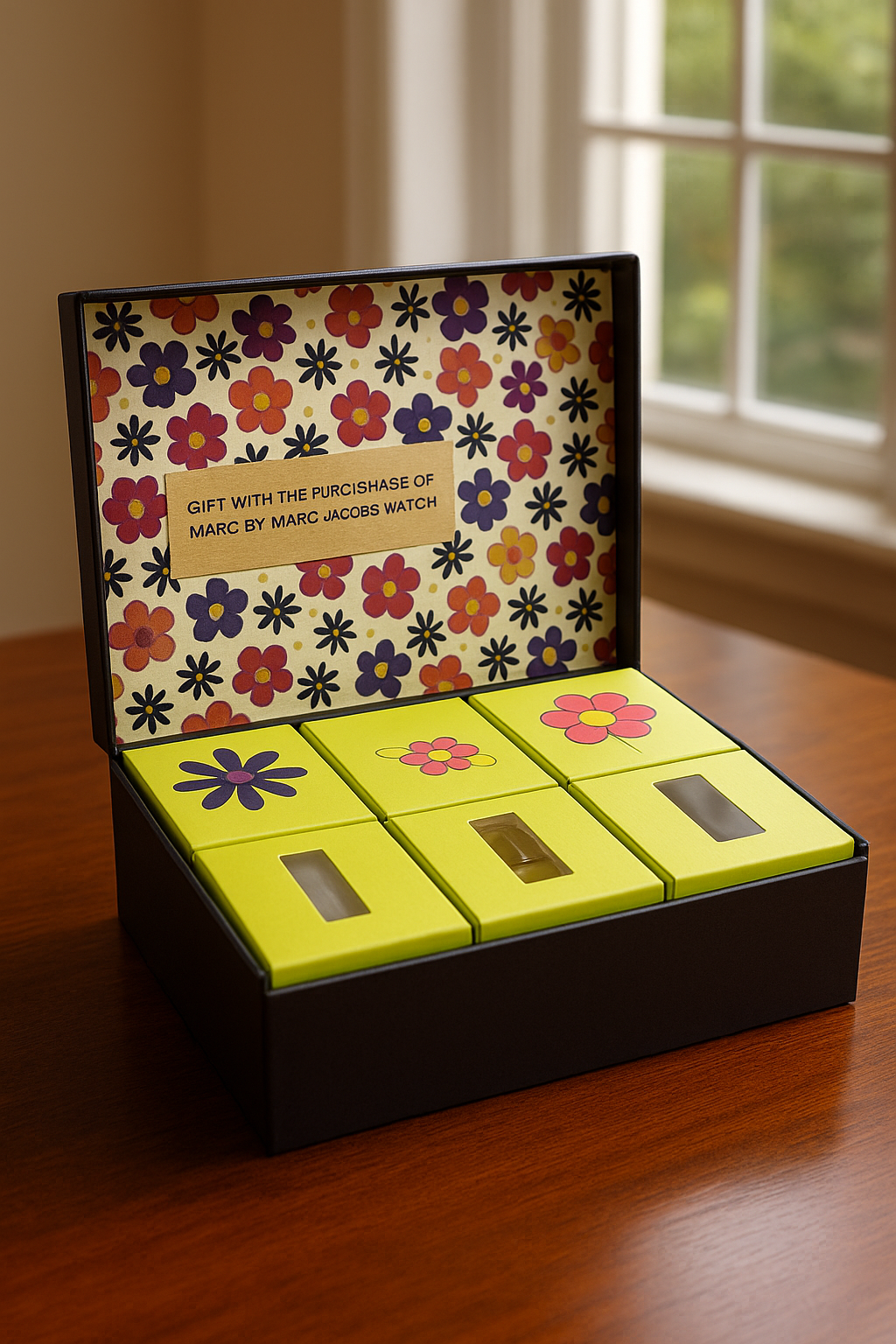
Shapes and Structures: Going Beyond the Box
It’s easy to default to the standard box, but structure is where creativity can thrive. Unusual shapes invite curiosity. When someone sees a triangle package or a tube-shaped case among rows of rectangles, they’re more likely to pause for a closer look.
Standout structures don’t always need to be complex. Even small details can make a big impact. A curved edge, a pull-out drawer, or an angled flap changes how someone interacts with your product. Windows or cutouts can offer a sneak peek at what’s inside. Tear strips can attach a moment of satisfaction to the opening experience.
Before making structural changes, ask:
– Can the packaging still protect the product during handling and storage?
– Will it fit neatly on store shelves or hook displays?
– How does this shape affect production costs or material choices?
– Is the design easy to open and user-friendly?
A clever structure should add to the entire unboxing moment, not frustrate it. Pick shapes that support functionality while adding to the visual appeal. The goal isn’t strange for the sake of standing out. It’s purposeful design that enhances how customers see and experience the product.
Imagery and Graphics: Visual Elements That Tell a Story
Pictures, icons, and illustrations do more than decorate the outer shell. They help tell the story of your product. If you can show who it’s for and what it does in a way that’s easy to understand, you’re already ahead.
Let’s say you’re packaging a ready-to-eat snack. Showing a crisp photo of the snack plated and ready can help the shopper imagine that experience. A toothbrush package might feature sleek, sharp visuals and line graphics to drive home themes of cleanliness and precision. Or maybe a baby lotion product leans into adorable characters and soft illustrations to comfort parents.
When working with graphics:
– Use visuals that feel in line with your brand personality
– Make sure they communicate something useful about the product
– Avoid dated or low-resolution images
– Keep layouts clean so important details don’t get buried
– Choose imagery that prints cleanly on chosen materials
Graphics can also be more subtle. A pattern of icons, soft background motifs, or faint accents all help fill out the package design without adding clutter. These small elements round out a package and add that extra bit of polish.
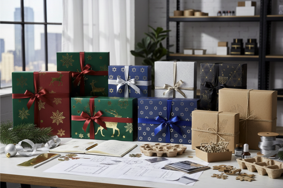
Finishing Touches: Coatings and Textures That Stand Out
Finish isn’t the first thing someone sees, but it’s one of the first things they notice when they touch and pick up your product. That tactile moment tells them a lot. A soft matte coating might feel calm or luxurious. A crisp gloss can make colors pop. Add in embossing, foil, or linen texture, and suddenly your box isn’t just nice—it’s memorable.
Consider what the finish says visually and physically. If your product is positioned as a premium gift, touches like foil stamping or soft-texture coating can create a sense of value. If your brand leans more natural and eco-friendly, a raw kraft look might line up better.
Keep in mind:
– The product’s storage environment (heat, cold, humidity)
– How fragile or bold the coating needs to be
– Sustainability and recyclability goals
– Whether finishes will boost or skew audience expectations
If you’re launching a holiday collection, a textured foil on a matte background feels festive without shouting. That contrast between touch and look is what makes people take a second glance—or snap a picture.
Finishes aren’t just for show. They reinforce what your brand stands for while offering a handshake to the buyer.
Crafting Your Package Design Strategy
When it comes to shelf appeal, every choice adds up—color, fonts, structure, graphics, and finish. Strong packaging grabs attention in just a second or two. People pause, recognize something special, and then connect with the product. That’s the goal.
Start with the story you want to tell. Then build your packaging so it supports that story from every angle. Make design decisions that work well together, rather than standing on their own. Consistency across different products or expansions also helps create brand trust and shelf strength across more store space.
Don’t overlook the power of a small design detail. That raised texture, just the right shade of green, or perfect font spacing can be the thing that moves someone from looking… to picking it up… to buying.
When your package design pairs creativity with purpose, you’ll turn heads, gain loyalty, and maybe even earn a spot on someone’s social feed. Every touchpoint matters—and it starts with smart, thoughtful packaging.
Discover how Rock Valley Packaging can bring your product to life with innovative designs that speak to your audience. Our packaging design services offer the perfect mix of structure and creativity, helping your product stand out without overcomplicating things. Let us show you how great packaging pulls its weight from shelf to shipment.