Introduction
Shoppers make decisions quickly. When your product sits on a shelf or counter next to a dozen others, it has just a few seconds to make an impact. That’s where display box design steps in. A great cosmetic display box doesn’t just hold your product. It presents it in the best light possible. The right packaging grabs attention, communicates your brand, and influences purchase decisions—all before the product is ever picked up.
A sleek design, smart layout, and strong structure work together to boost visibility. For cosmetics, where visual appeal is everything, people often want to see the product before buying. Your packaging should show it off with confidence. But creating an effective design takes more than just slapping on a logo. You need to think about where the product lives, what draws customers in, and how to keep everything looking clean and crisp through long hours of display.
Understand Your Display Environment
Before jumping into sketches and dielines, take a second to think about where your product will actually live once it’s packaged. Is it going in a boutique skincare shop? Sitting in line at a pharmacy checkout? On a shelf next to competitors in a supermarket? The answer will affect everything, from text placement to how bold the graphics need to be.
Here are the environmental factors worth mapping out before you start:
– Lighting: If your product will be under bright fluorescents, certain colors can get washed out. Dim light? Dark boxes might disappear. Choose your tones and finishes accordingly.
– Shelf or counter height: If it’s positioned below eye level, put your most important messaging toward the top half. If customers look down at it, central focus shifts.
– Customer flow: Is the box facing head-on foot traffic or turned to the side? This affects where your logo and product name should go.
– Visual noise: On a jam-packed retail shelf, your box competes for attention. Use contrast and bold design details to stand out without clashing with nearby items.
Picture this: you’re selling a botanical serum in a boutique shop where shelves sit below chest height and sunlight pours in through street-facing windows. Pastel packaging might fade out or get lost under that light. A clean white or earth-tone background with pops of texture or foil might hold up better and still feel natural. Use this kind of thinking to guide the early design steps.
Design gets a lot easier when you’ve already mapped out where someone’s seeing and grabbing your product in the wild.
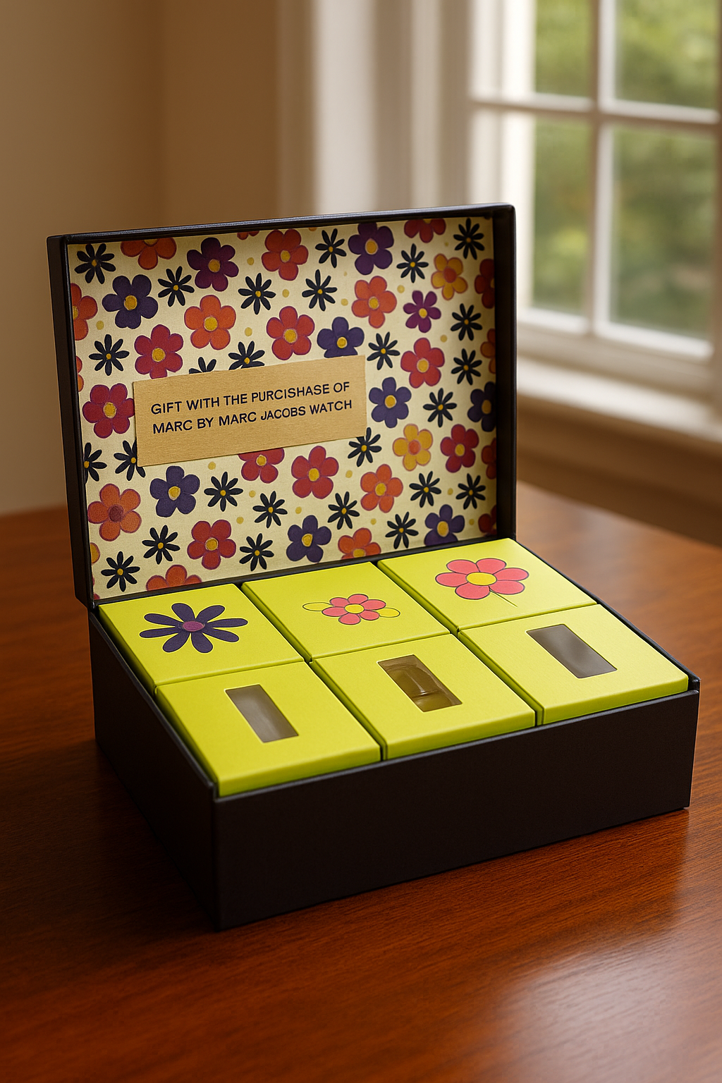
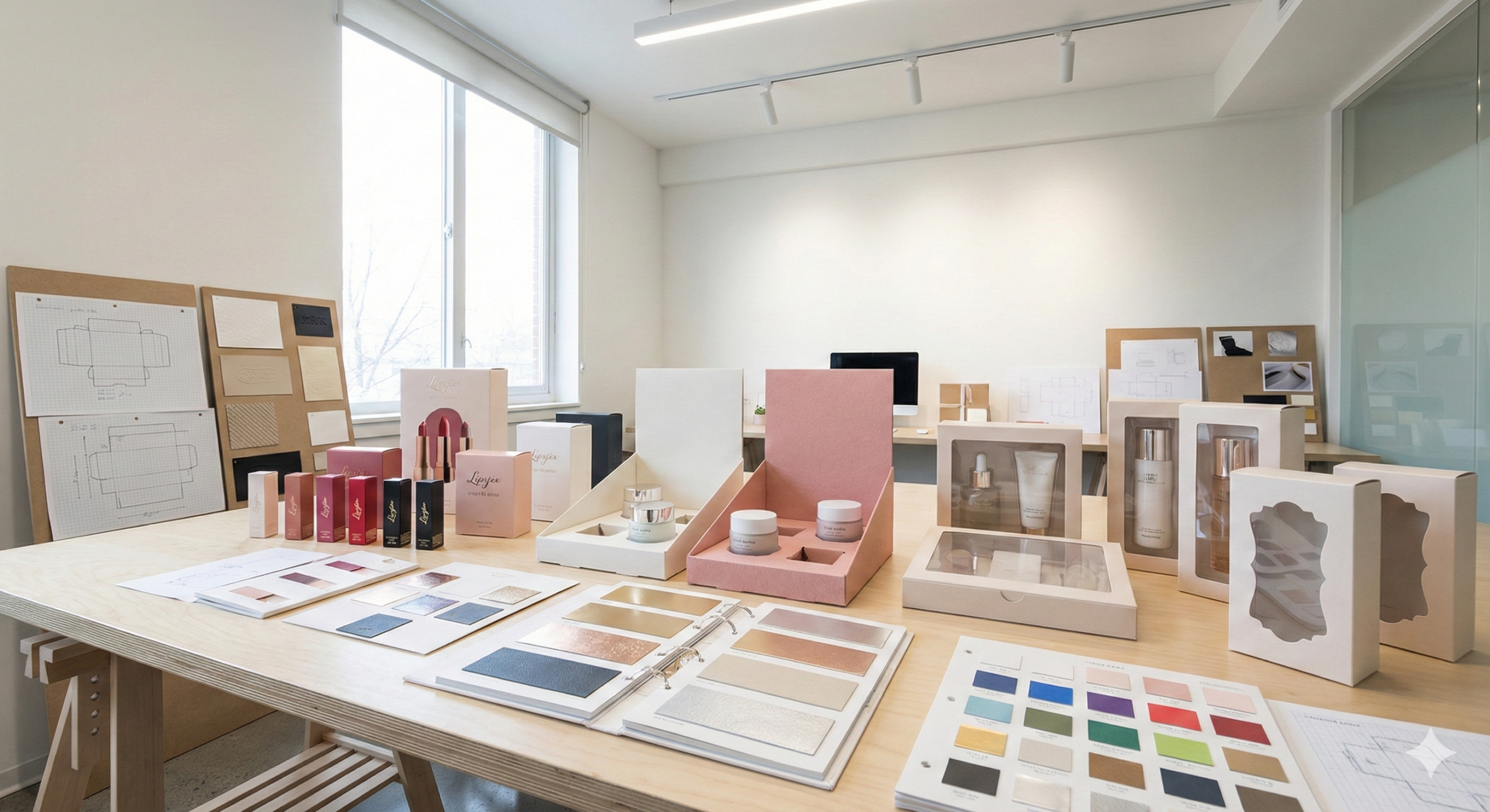
Make Use of Clear Windows and Cutouts
Letting people see what’s inside without opening the box gives you a real edge—especially in cosmetics. People love being able to spot a lip shade, lotion texture, or shimmer level before making a decision. Display boxes with a clear window or well-cut open section can do the trick.
But balance is key. Big windows can weaken the structure, while tiny ones may not grab the eye. Start by thinking about your product’s size and shape. That helps guide the ideal window placement and design style.
A few quick tips for getting it right:
1. Choose materials that stay strong even with cutout areas.
2. Add reinforcement to thin spots around windows or open edges.
3. Use scratch-resistant film if you go with a plastic window. It should also resist fogging or warping over time.
4. Match the look to your product. Rounded shapes feel natural or handmade. Straight edges suggest a modern, clean brand.
Think of these cutout features as a way to tease what’s inside. It’s like offering a free preview—no opening needed. When the design fits seamlessly into the layout of the box, it feels high-end and intentional.
Customers are more likely to touch or examine a box that gives them a peek inside. That boost in interaction could be the nudge they need to buy. If done thoughtfully, these touches give off a message that the product inside is worth showing off.
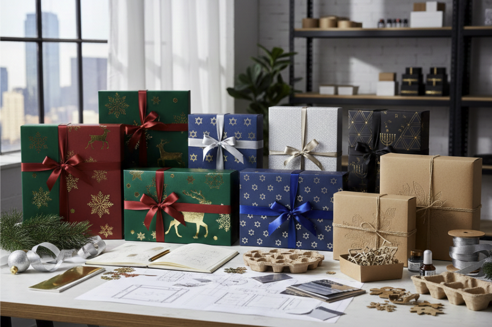
Optimize Color and Graphics
When someone walks past your product, they’re probably seeing it from several feet away. Your job is to make sure it catches their eye and tells a story in seconds. That’s where design choices like color and layout come into play.
Start with color. It shouldn’t just look good. It should support the product type and brand vibe while standing out against surroundings. Natural creams and oils might work best with teal, soft brown, or white. Edgy eye makeup lines might lean into darker tones or metallics. Contrasts make the box pop, so think about how your packaging will look next to others on the shelf.
Don’t skip print clarity. Logos and important text should be easy to read from a few feet away. Avoid fancy fonts unless they’re large. Stick to clean, readable typefaces that show well in lower lighting too.
Then there’s image use. Whether you have a product shot, lifestyle photo, or ingredient visual, make sure the print is high resolution. Pixelated print makes the whole box feel cheap.
Try this quick test after you create a mockup. Set the display next to other brands and take a few steps back. Ignore your bias. Ask yourself honestly: would a customer grab this first? If not, something needs adjusting—maybe the logo size, a switch in color, or cleaner edge framing.
Design matters more when the box does the talking for you.
Designing for Long-Term Structure and Shelf Life
Looks aren’t everything—especially if your packaging gets beat up in shipping or bruises after a few days sitting out. Great cosmetic display boxes stay sharp from your warehouse to the sales floor. That requires smart material choices and sturdy design work.
Support starts with the basics: what’s inside? A box full of light sample pouches doesn’t need the same structural support as one holding a glass serum bottle. Heavier items need thicker boards, reinforced tabs, and stronger closure points.
Use these tips to fortify any cosmetic display box:
– Protect stress points like bottom flaps and inner folds with added weight or reinforced seams.
– Choose coatings that resist smudges or wear. If people are touching this box often—like at a beauty sampling station—it needs protection.
– Test closure and opening features for repeated use. If staff keep restocking or rearranging, weak tabs can damage quickly.
– Try assembly with real products inside. Any warping or bulge could tell you a tray needs tweaking or a glue path isn’t strong enough.
Display time matters too. If a box is sitting out for weeks, it needs to stay crisp. A sagging display makes a brand look tired or careless. Building strength into the design once means fewer headaches later.
Think of durability as your silent salesperson. A polished package that stays intact helps carry your brand message long after shipment.
Make Your Display Work Harder
Your cosmetic display box has a big job. It needs to show off your brand, invite someone to pick it up, and protect what’s inside—all in just a few seconds of attention. Smart packaging design pulls it off using a mix of practical choices and brand-forward thinking.
Start where your product will sit: light, height, traffic patterns, and shelf clutter should guide your first layout choices. Let the box reflect your message through shapes, color, and graphic elements. Allow people to sneak a peek through a window or cutout, and choose materials that look good and last.
Packaging isn’t just a container—it’s often your product’s first impression. Make sure that impression is confident, sharp, and easy to spot. When design choices come together the right way, your box doesn’t just sit there. It works. And it helps your product move.
Ready to elevate your product’s appeal and make it stand out on the shelf? Explore how thoughtfully designed cosmetic display boxes from Rock Valley Packaging can help you capture attention and spark interest at a glance. Let’s talk about how we can bring your packaging ideas to life with bold style and smart engineering.